10 hospitality dashboards every operator needs (with examples)
The dashboards that actually help hospitality operators run the business — hourly sales heatmaps, basket analysis, store comparison, loyalty, wastage and more — with real examples of each.
· 9 min read
A hospitality analytics dashboard turns raw POS and PMS data into a view an operator can act on — when products sell, which venues are underperforming, what items sell together, and where margin is leaking. The problem is that most reporting stops at "here are yesterday's totals". The dashboards below go further: each one answers a specific operating question a cafe, restaurant, or multi-venue group asks every week.
Here are the ten dashboards that matter most for hospitality operators, what each one reveals, and an example of it in intraQ. Every one is built from a plain-English question against your own POS or PMS data — no analyst, no manual export.
1. Hourly sales heatmap — when products actually sell
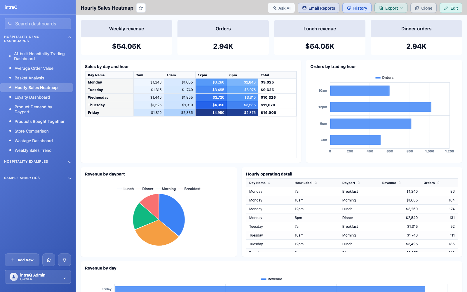
A sales heatmap by hour and day of week shows exactly when demand peaks. Instead of a flat daily total, you see the morning coffee rush, the lunch spike, and the quiet mid-afternoon. That lets you match staffing and food prep to real demand rather than a guess — and stop over-producing during the lulls.
2. Product demand by daypart
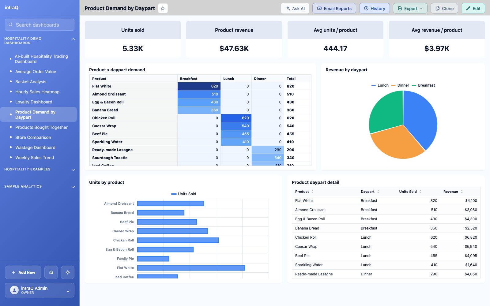
Breaking product sales down by daypart answers a question totals hide: which items drive each part of the day. Pastries might peak between 7 and 9am while coffee sells steadily until close. Knowing this changes what you prep, when you promote, and how you time staff upsell prompts.
3. Weekly sales and covers trend
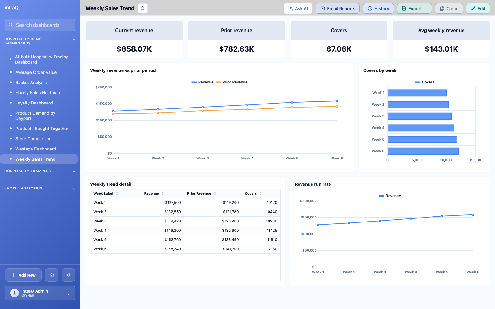
A weekly trend of revenue and covers against the previous period is the fastest health check there is. It separates a real problem from normal variation, and shows whether a dip came from fewer covers or a smaller average spend — two problems with very different fixes.
4. Basket analysis — what sells together
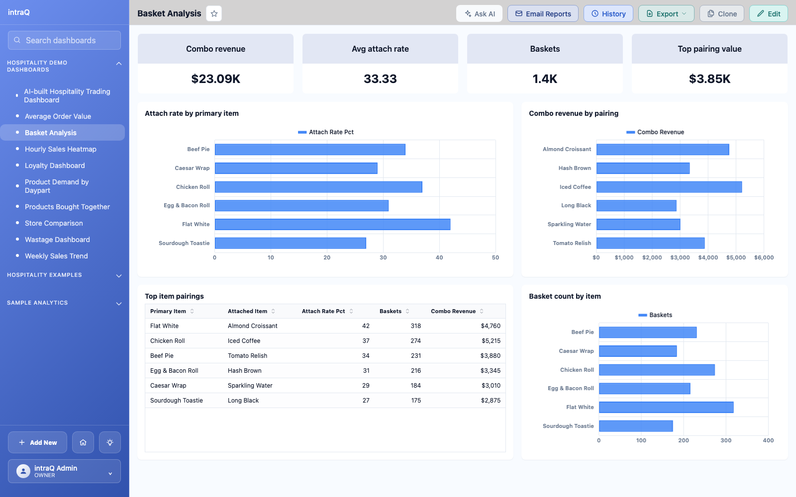
Basket analysis shows which products are bought together and how strong each attachment is. This is where combo offers and upsell training should come from — not intuition. If a profitable add-on is rarely sold with a core item, that gap is a concrete revenue opportunity you can test.
5. Product affinity — the strongest pairings
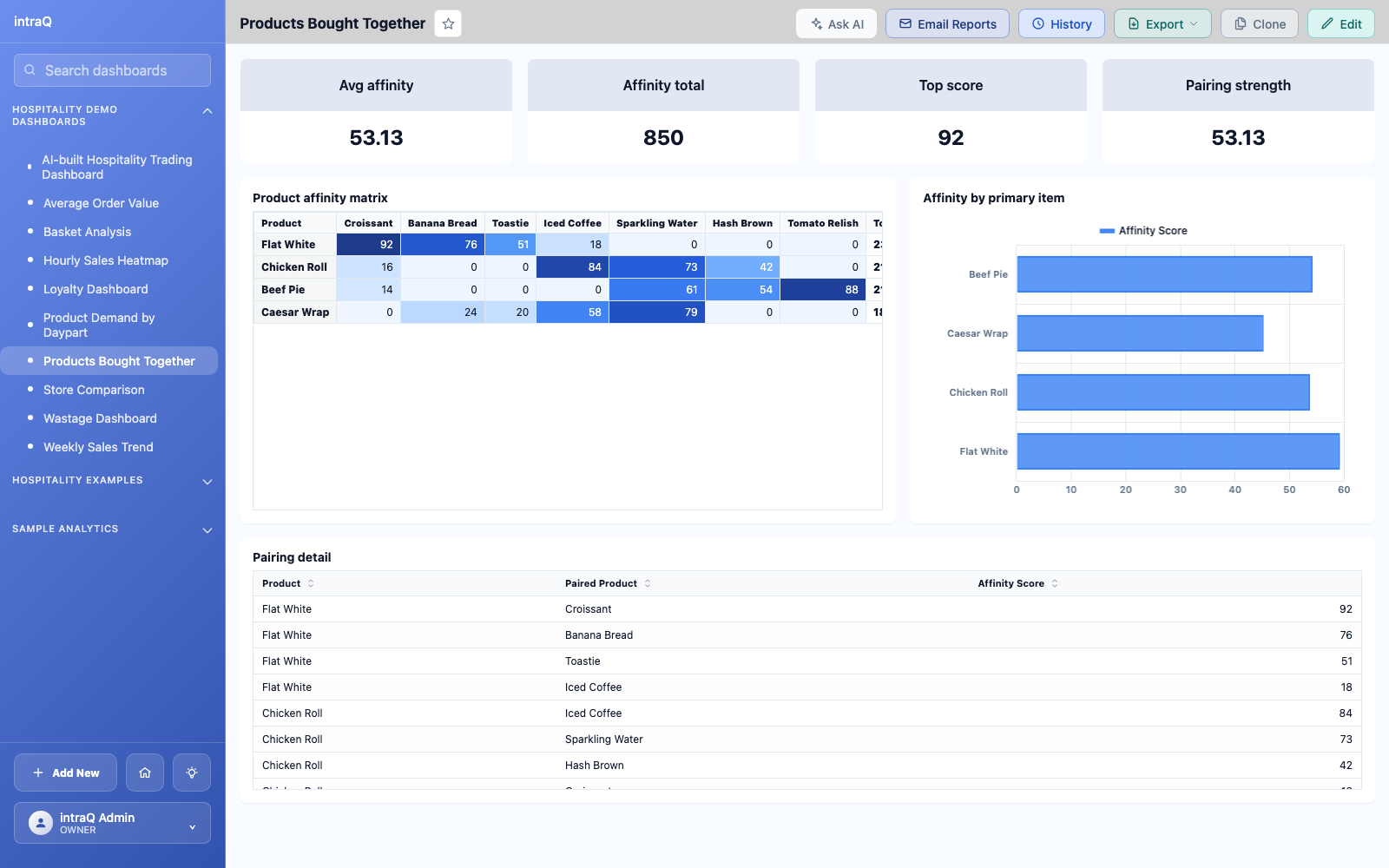
A product affinity matrix ranks item pairings across thousands of transactions, surfacing relationships a manager would never spot manually. Some pairings confirm what you expected; the valuable ones are the surprises — an item that quietly drives attach sales in one venue but is never pushed in another.
6. Store-wise comparison
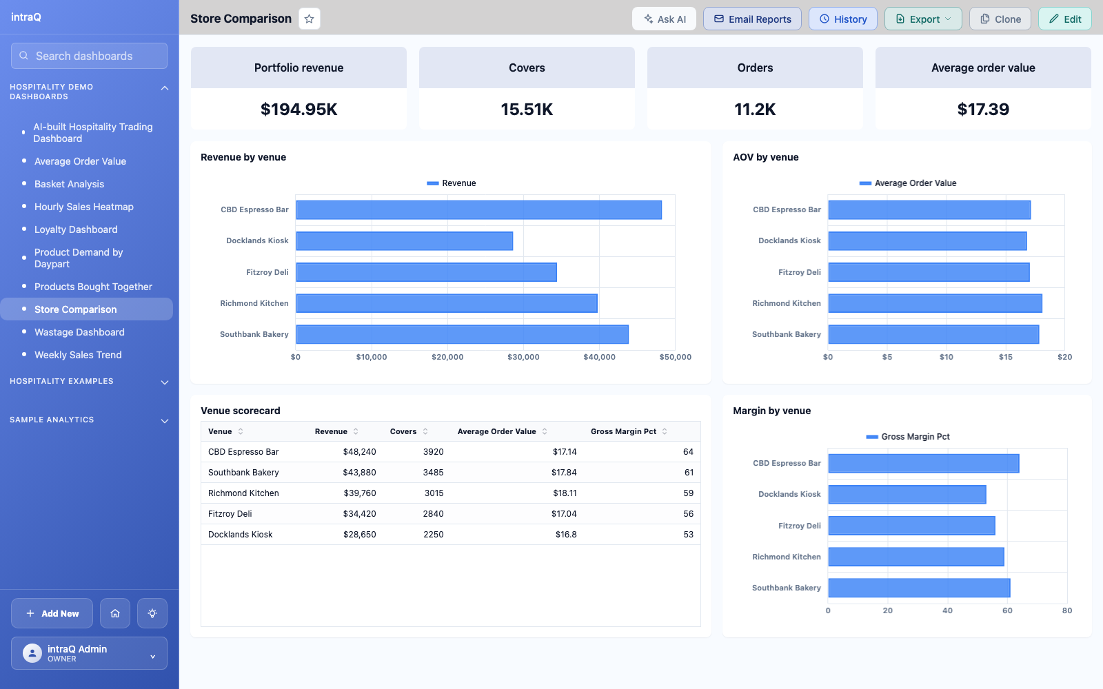
For multi-venue groups, a store-wise comparison ranks locations by revenue, covers, and average order value so the outlier is obvious. Instead of stitching together separate reports per site, you see immediately which venue slipped this week — and can drill into whether it was covers, basket size, or a specific category.
7. Loyalty dashboard
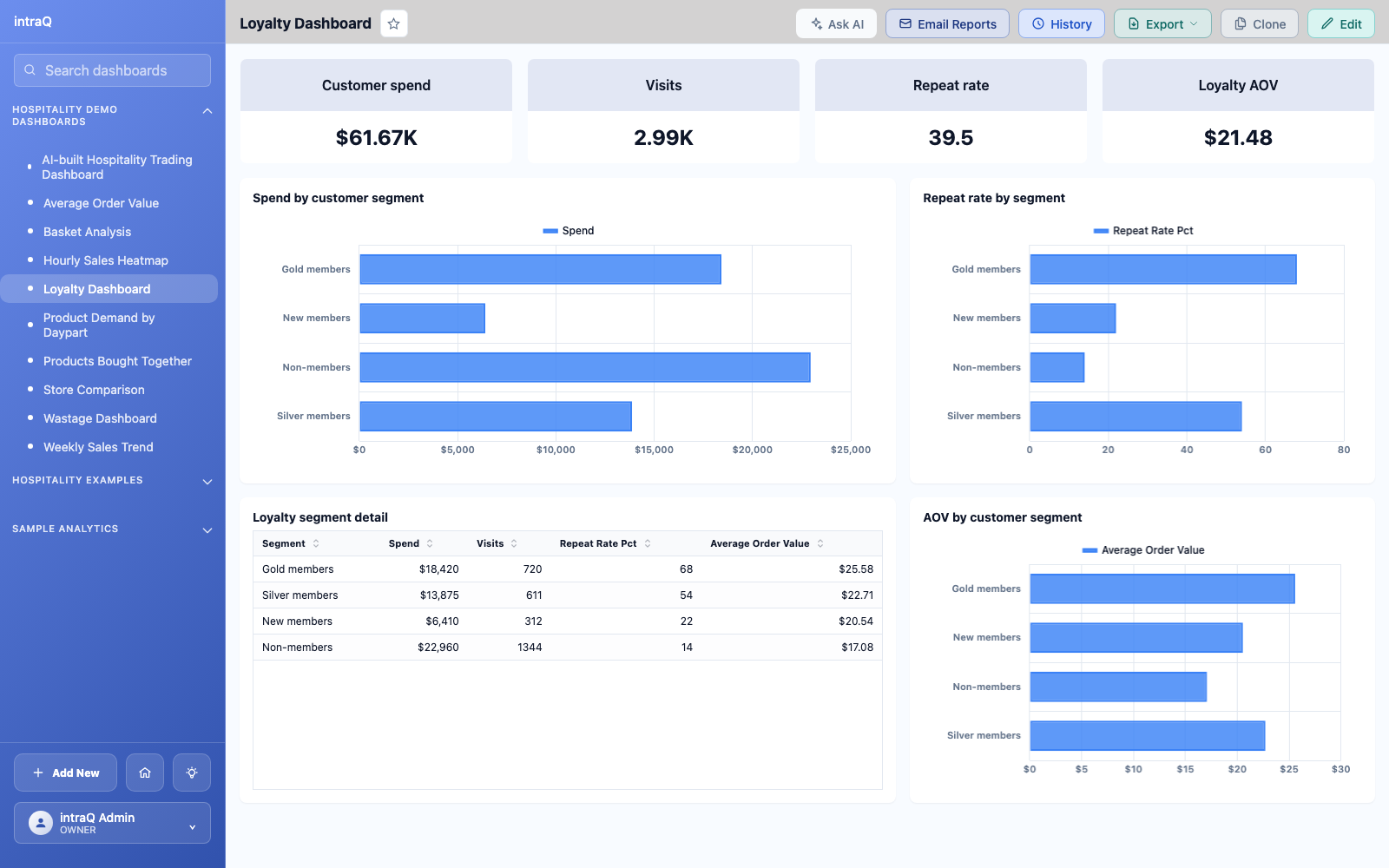
A loyalty dashboard compares member and non-member spend, tracks repeat-purchase rate, and identifies your most valuable customers. It answers whether the loyalty programme is actually changing behaviour — and which members are worth a personal touch.
8. Average order value
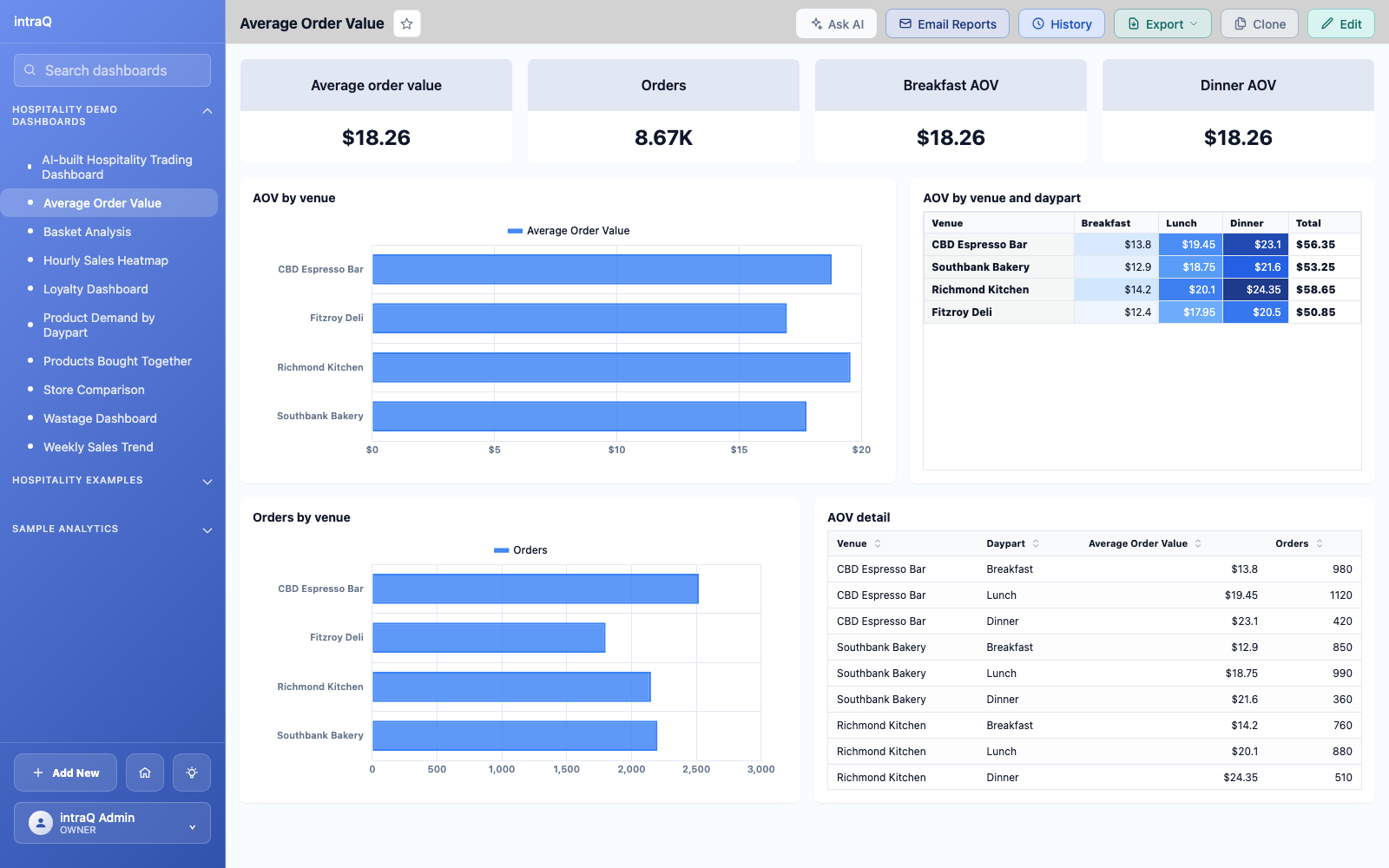
Average order value by venue and daypart shows whether a location is selling more premium items or quietly losing value per head. Two venues with similar revenue can have very different AOV — and that gap usually points to menu mix, upsell discipline, or discounting.
9. Wastage dashboard
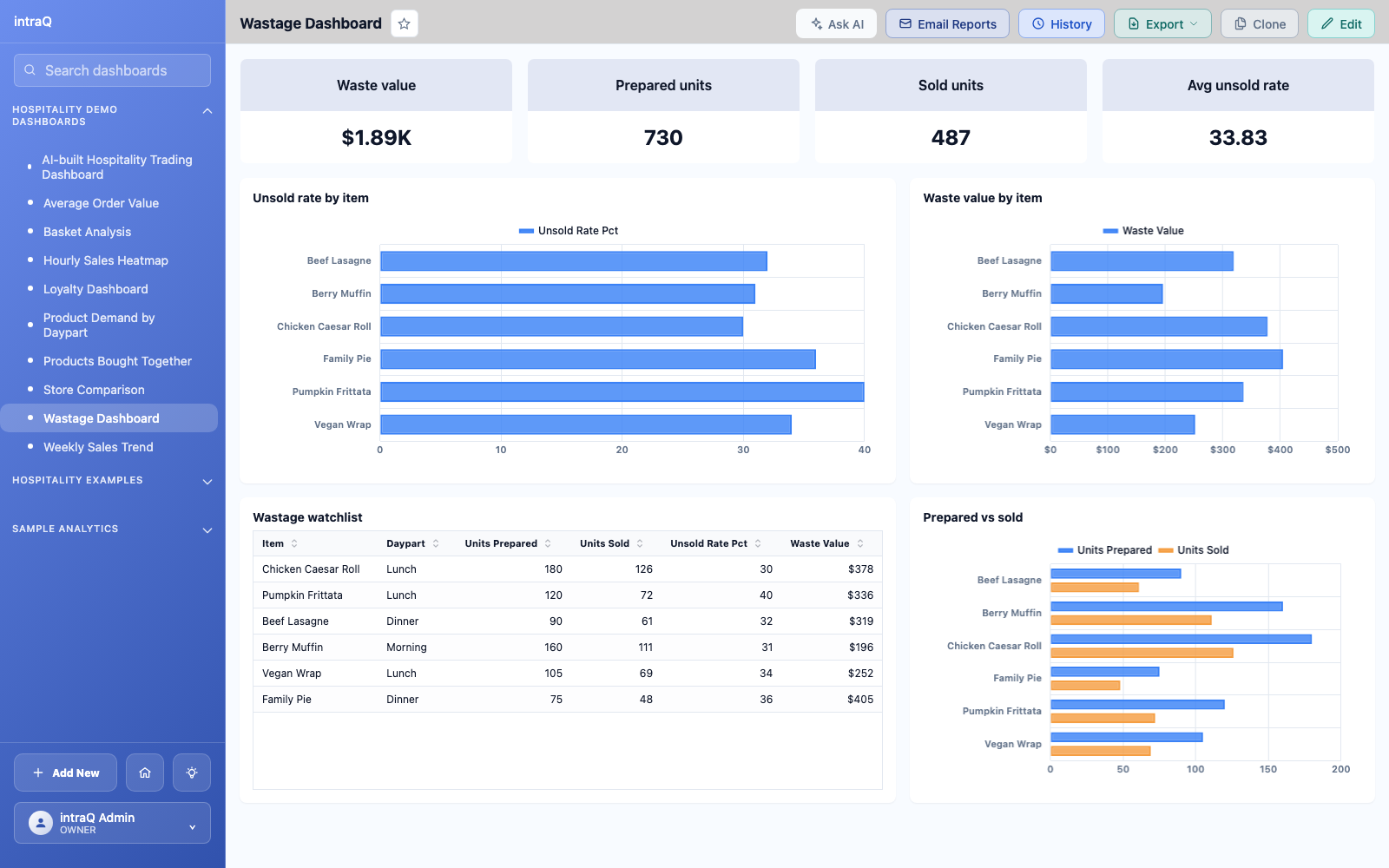
For ready-made food — bakery, sandwiches, grab-and-go — a wastage view flags slow-moving items by daypart and location before they become waste. When production is matched to demand this way, wastage stops quietly eating margin, and you know which items to promote earlier in the day.
10. Ask a question, get the dashboard
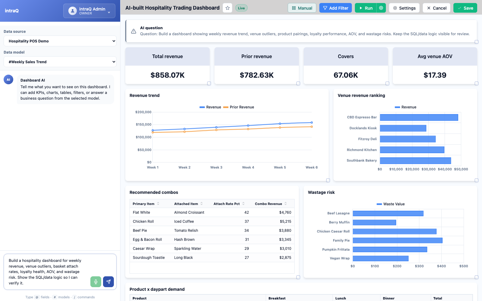
Every dashboard above starts as a plain-English question. In intraQ you ask something like "compare revenue and covers by venue this week", and the system generates the SQL against your defined data model, returns the answer with its evidence, and lets you save it as a live dashboard. Because the answer is grounded in a Knowledge Layer — your metric definitions and business rules — the numbers are verifiable, not guessed.
How to build these without a data team
The traditional path to these dashboards is a BI analyst and weeks of setup. The shift in 2026 is that AI grounded in a defined data model can build them from a question, provided the underlying metrics and joins are trustworthy. intraQ connects directly to your existing POS or PMS database, applies your data definitions, and produces these views on demand — self-hosted, so guest and payment data never leaves your environment.
Frequently asked questions
What dashboards do hospitality operators actually need? The highest-value ones are an hourly sales heatmap, product demand by daypart, a weekly revenue and covers trend, basket and product-affinity analysis, store-wise comparison, a loyalty view, average order value, and a wastage dashboard for ready-made food.
What is basket analysis in hospitality? Basket analysis identifies which products are frequently bought together and how strong each pairing is, so operators can design combos, upsells, and menu placement based on real purchasing behaviour rather than intuition.
Can I build these dashboards without a BI analyst? Yes. AI BI tools that are grounded in a defined data model — like intraQ — let operators ask a plain-English question and generate these dashboards directly from POS or PMS data, with the underlying SQL visible for trust.